Role
UX/UI designer
Tasks
UX Research
UI Design
Game Design
Illustration
Get Fact is a word trivia game that was struggling with high user acquisition (UA) costs, low engagement, and an outdated user experience.
The game’s publisher initiated a redesign project to explore a new visual and interaction direction that could be tested through UA ads. The aim was to validate whether a more modern, polished experience could lower acquisition costs — with success defined as keeping UA below $1 per user.
This was a proof-of-concept, not a full production redesign. Based on the ad performance, the developer studio would decide whether to move forward with implementing the new direction. With a limited budget and no dev resources allocated, the focus was on creating high-impact, test-ready design work.
As the UX/UI Designer, I was responsible for researching player feedback, analyzing competitor games, designing a new interface, prototyping and testing alternative mechanics, and delivering final design recommendations.
I collaborated closely with the Project Manager, who ensured alignment with business goals, and with the Game Development Studio, whose input helped assess the feasibility of new interactions, particularly swipe mechanics and animations. Their feedback was critical in optimizing the design for performance across devices.
From $1.54 to $0.79 per user, exceeding the goal of staying under $1
The most successful prototype achieved a 27% increase in ad click-through rate, validating the design direction
The studio decided to move forward with implementing the new design in the actual game
The first step involved understanding the competitive landscape and identifying design elements that could improve engagement. I conducted an in-depth competitor analysis, focusing on UI design, aesthetics, and user experience. This analysis confirmed that UI and aesthetics significantly influence engagement and retention in mobile word games. Modern, visually appealing designs contribute to higher player satisfaction, while uninspired or outdated visuals can make a game feel unpolished
Game Title | Developer | UI Design Philosophy | Aesthetic Features | User Experience Elements |
---|---|---|---|---|
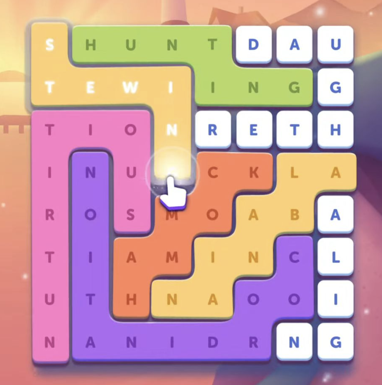
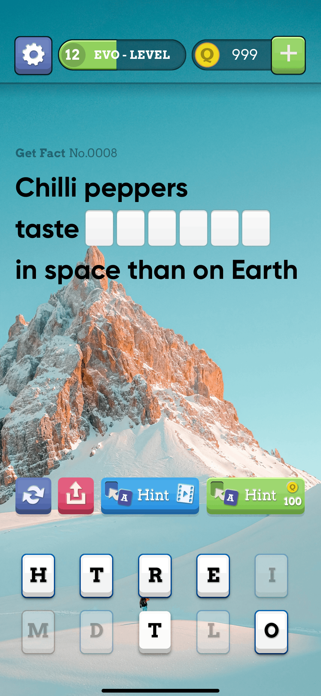
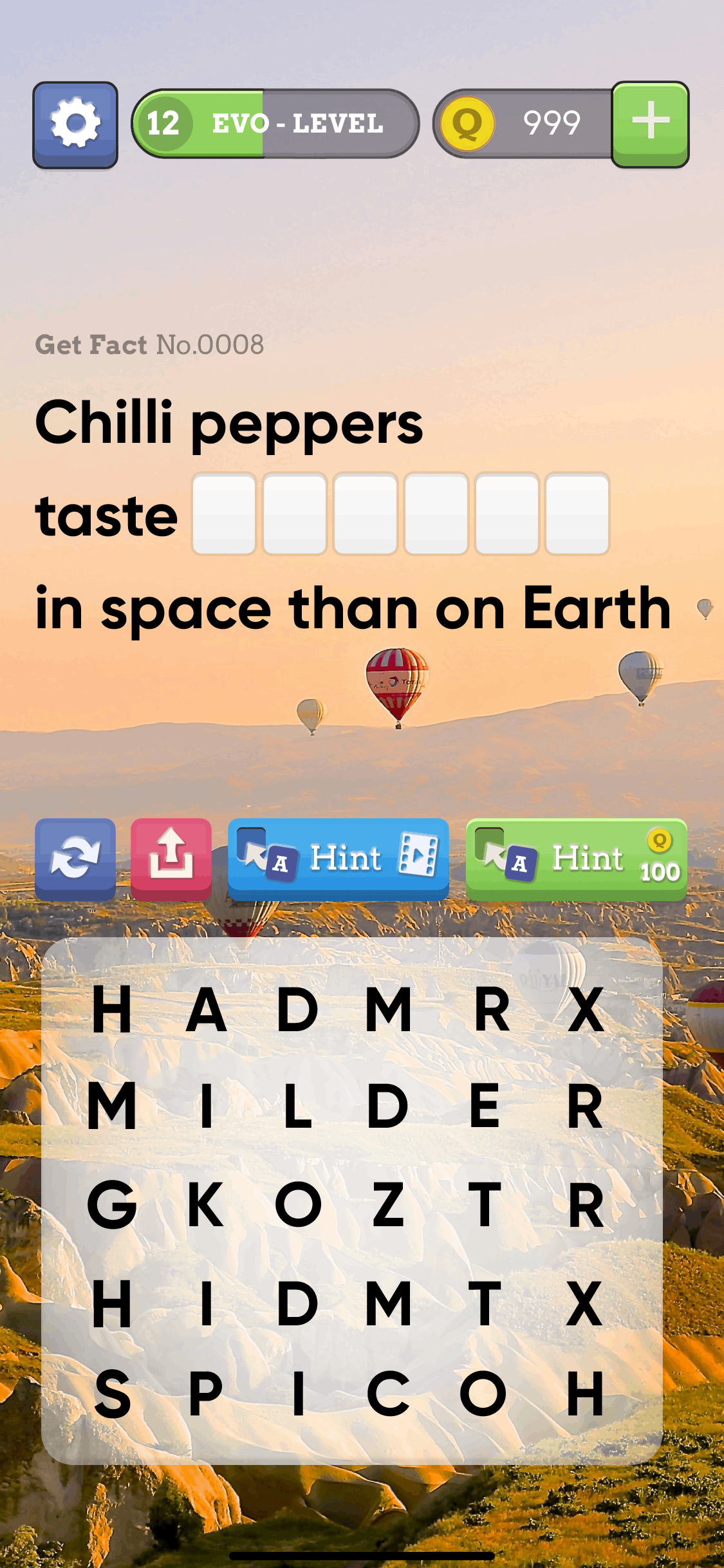
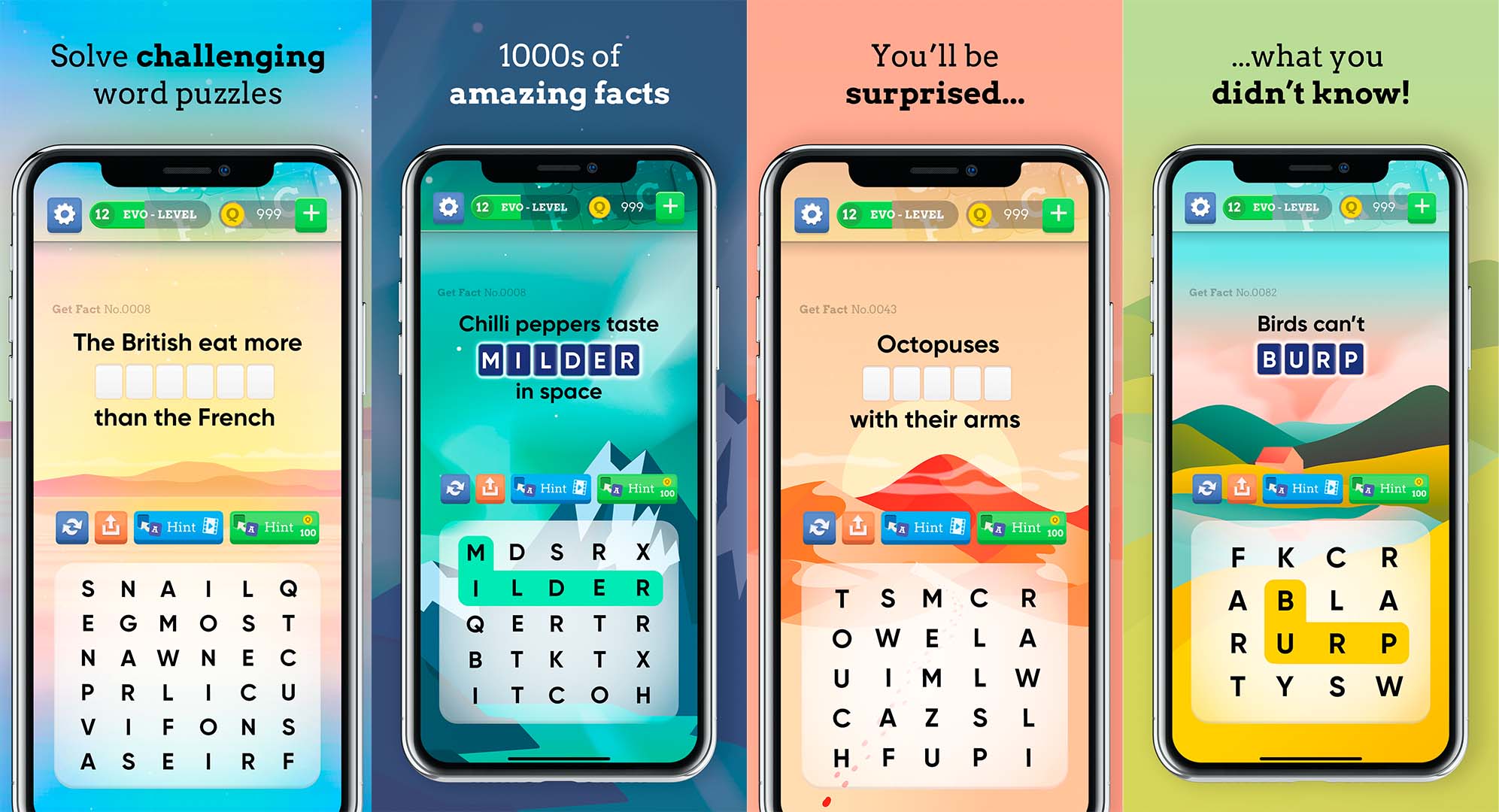
Wordscapes | PeopleFun | Simplicity and natural beauty, evoking open spaces. | Soft colour palette with pastel backgrounds- Nature-inspired visuals- Clean typography | Intuitive navigation- Smooth animations enhance gameplay- Daily challenges keep users engaged |
Word Lanes | Fanatee | High-quality graphics that promote relaxation and engagement. | Vibrant, colourful backgrounds- Themed visuals for different levels- Clear, legible fonts | Calming animations create a soothing experience- Easy-to-use interface supports casual gameplay |
Word Guess | Mediaflex | Functional design focusing on straightforward gameplay. | Basic UI with minimal graphics- Limited colour scheme; utilitarian approach | Simple layout allows for quick understanding of mechanics- Less emphasis on aesthetics may deter some users |
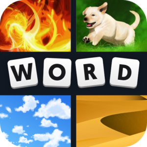
4 Pics 1 Word | Lotum | Engaging and visually stimulating to attract players. | Bright, colourful graphics that enhance interaction- Clear imagery aids in guessing | User-friendly layout encourages quick play- Engaging visuals keep players interested |
Words With Friends | Zynga | Social connectivity through a vibrant, interactive interface. | Dynamic board layout with colourful tiles- Engaging animations during gameplay | Turn-based play encourages social interaction- Notifications keep players returning to the game |
Wordle | Josh Wardle | Minimalist design prioritizing functionality over embellishment. | Simple grid layout with high contrast for easy visibility- Dark theme option available | Colour-coded feedback provides immediate visual cues for player progress- Straightforward mechanics enhance accessibility |
Word Salad | Aleppo | Playful and whimsical design to appeal to casual gamers. | Colourful, playful graphics with engaging animations- Fun typography that adds character | Interactive elements encourage exploration of word formation- Family-friendly design attracts younger audiences |
I also examined player feedback from Get Fact, which revealed interesting pain points: Clunky and uninspiring mechanics and an outdated look and feel, as well as frustration with the non skippable levels.
“I love word games, but this one just feels stiff. The mechanics are kind of clunky—tapping letters instead of swiping makes it less intuitive. It doesn’t feel as smooth or satisfying as other word puzzle games I’ve played. Overall it’s a decent game, but it just feels outdated.”
“Some levels are way harder than others, and there’s no way to move forward if you get stuck. It would be great if there was an option to come back to a tricky level later instead of being completely blocked.”
The design phase focused on reducing friction and creating a more emotionally engaging experience. The interaction model was redesigned from the ground up, we explored multiple mechanic variations, including circular letter groupings, crossword-style puzzles, and a word search layout. These were tested to find the right balance between challenge and accessibility.
To update the visual tone of the game, I explored different styles—ranging from nature photography and abstract textures to hand-crafted illustrations.
I developed several design variants and tested them via UA ad campaigns, each with a different combination of mechanics, visuals, and UI structure. One prototype—featuring word search puzzle gameplay, illustrated environments, and reward animations—clearly stood out, achieving a 27% higher click-through rate and improved install intent.
I created a new visual identity based on illustrated landscapes, giving each level its own atmosphere. These backgrounds used soothing colour palettes and soft shapes to evoke a sense of curiosity, progress, and calm. This helped set Get Fact apart visually in a crowded market.
These iterations shaped the final prototype:
App store screenshots
Get Fact had a solid concept, but outdated design was holding it back in a highly competitive space. Through a combination of interaction redesign and a distinct, illustrated visual identity, the game was transformed into a more engaging and cost-effective experience.
This project demonstrated how even lightweight, design-led experimentation can deliver valuable business insights. By focusing on high-impact visual and UX improvements for UA testing, we were able to validate the potential of a larger redesign effort — proving that design isn’t just about aesthetics, but about guiding strategic product decisions.