Loading

Simplifying for impact

UX strategy behind a leaner event platform

Role
Product designer

Tasks
User Experience
Strategy
Information Architecture

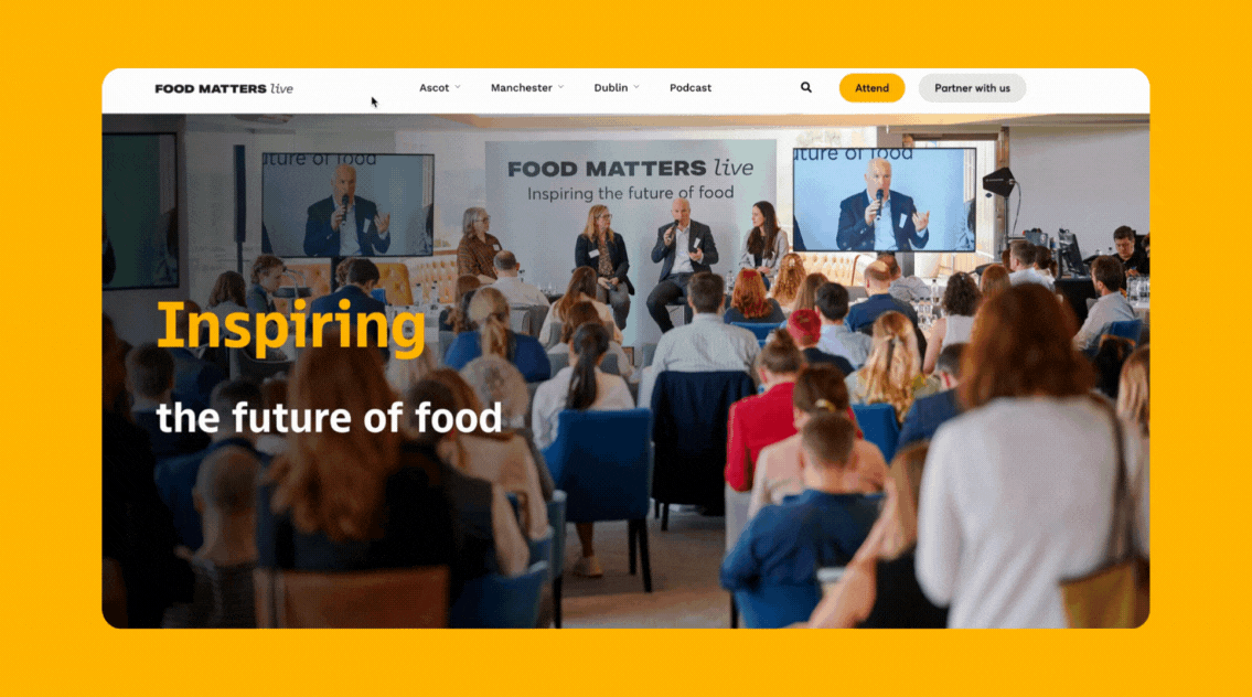
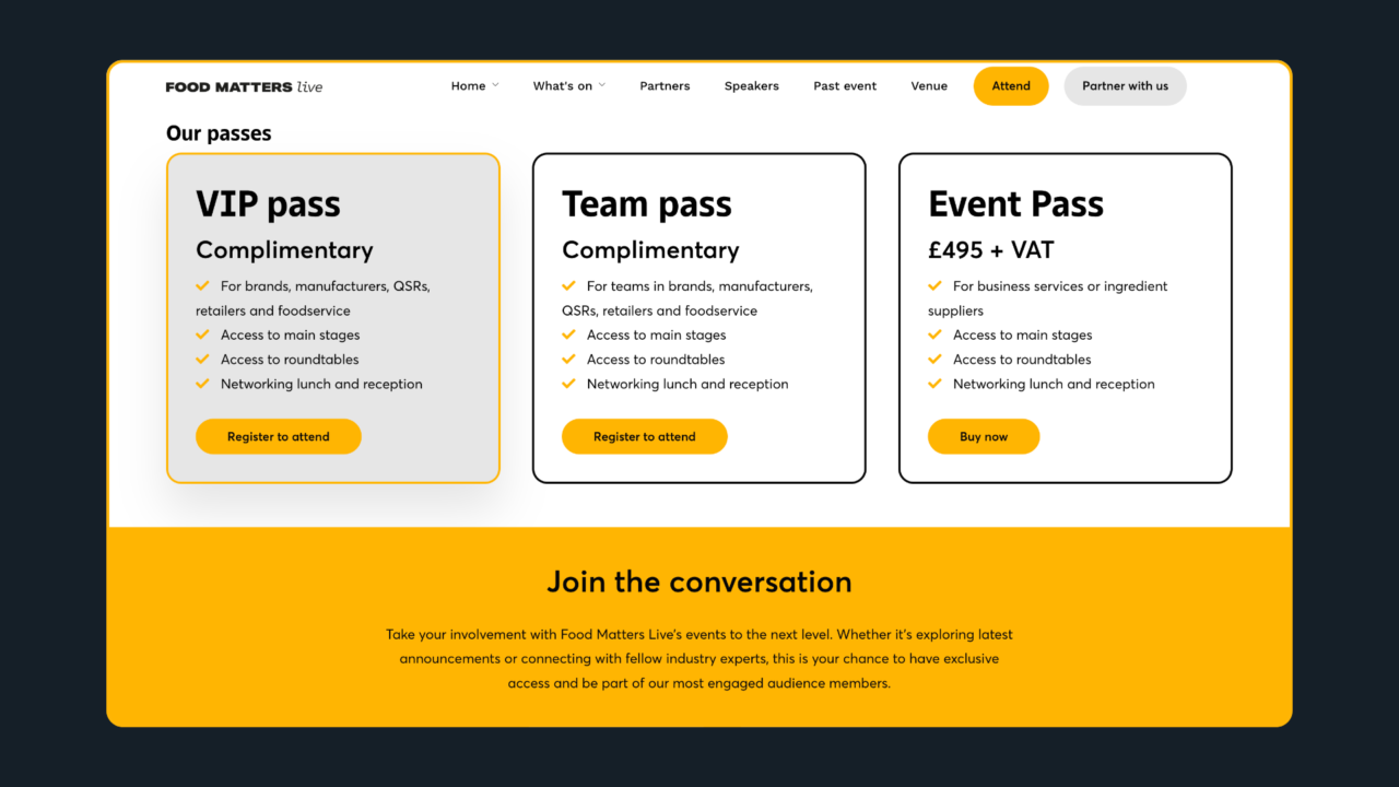
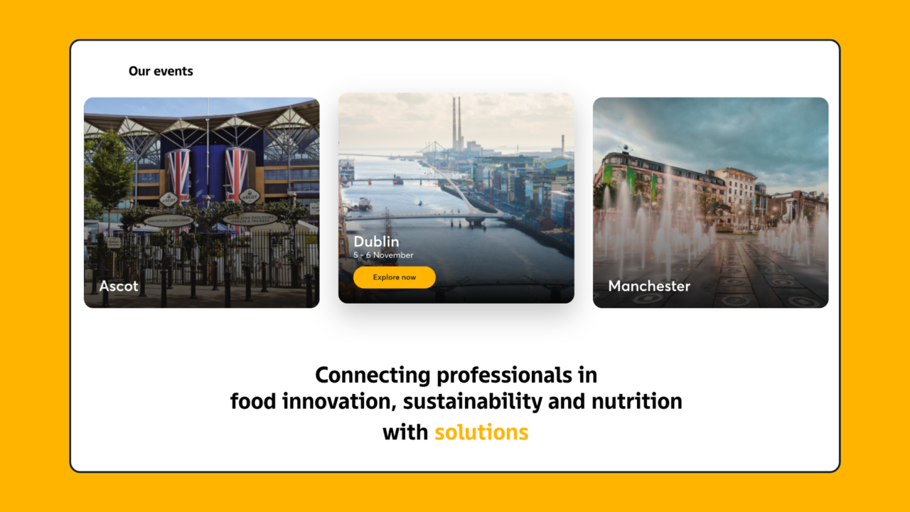
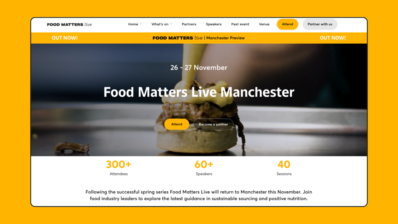
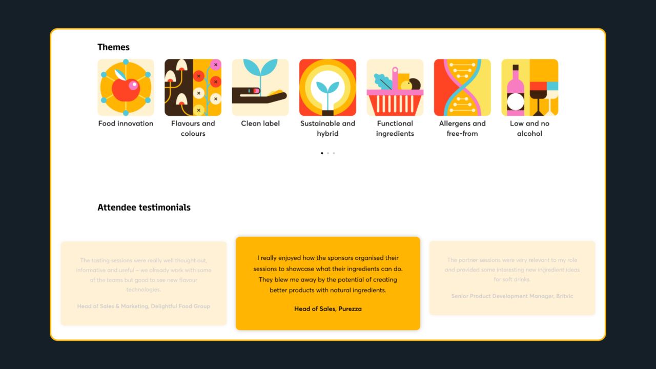
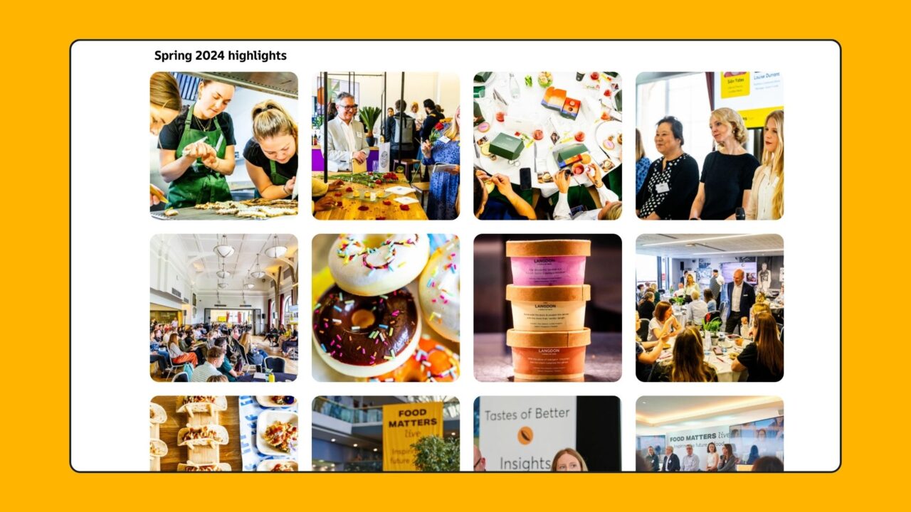
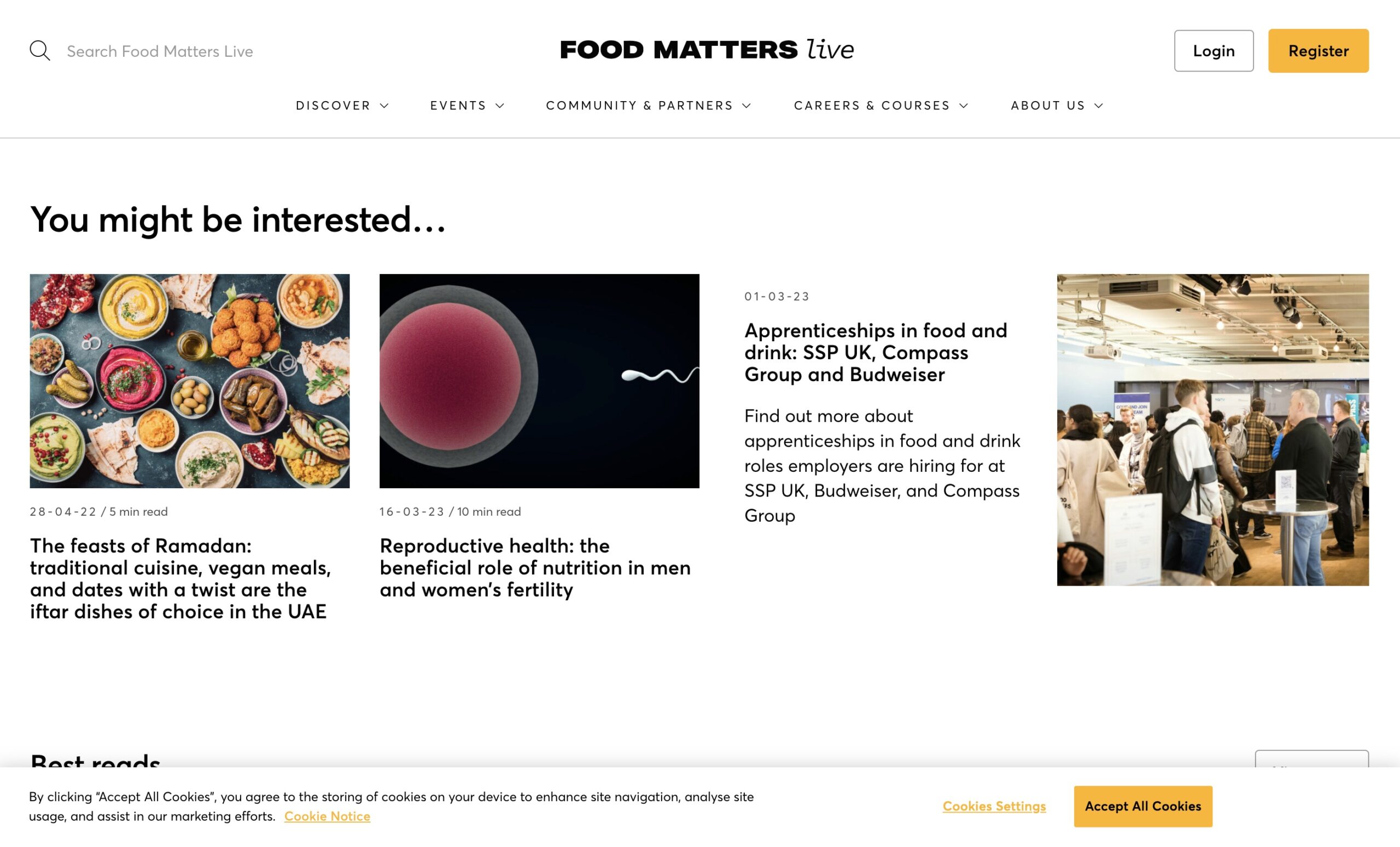
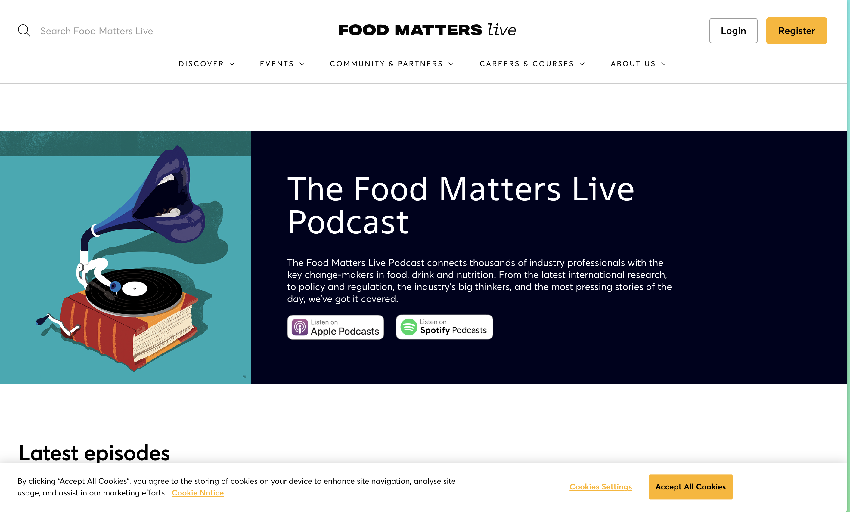
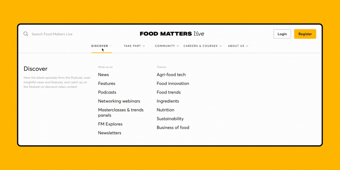
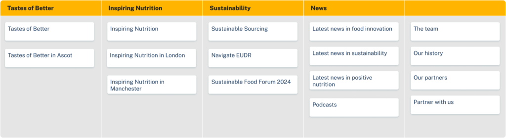
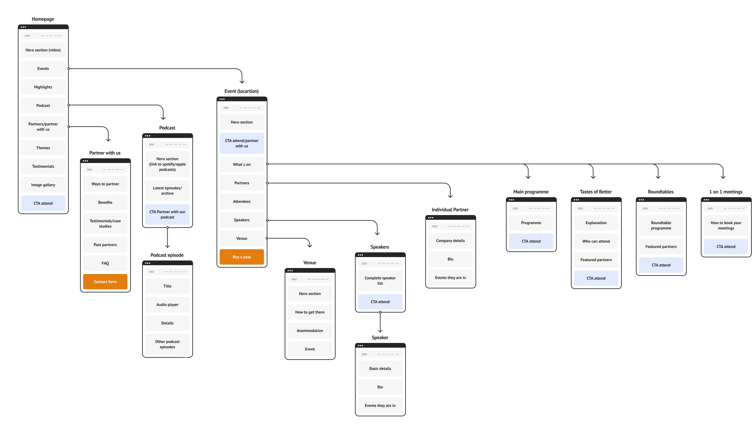
This project is a full redesign of the Food Matters Live website, with the focus on improving information architecture, refining user flows, restructuring navigation, and updating the visual design to better support the company’s shift back to in-person events.

The Challenge

As Food Matters Live shifted back to its core focus on in-person events, its content-heavy website—originally built around editorial and digital media—no longer reflected the company’s direction. Users struggled to find essential event information, and the site’s structure created friction rather than clarity. The redesign needed to streamline the experience and make the site easier to navigate.

The project faced three key constraints: a tight timeline, no budget for user testing, and shifting business priorities mid-project, all of which required a focused, adaptable approach.

Food Matters Live website screenshots and food matters live logo

 Role & Collaboration

As Product Designer, I led the strategic redesign of the website’s structure and user experience. I collaborated with the Managing Director to align the design with business goals, worked with Hello Content and Designer Rebecca Corcoran on visual updates, and partnered with Developer Kearlvin Lewin to implement technical improvements. Together, we delivered a clearer, more engaging platform that supported the new event-focused direction.

The Impact

Usability improvement
+ 0 %

Users reported significantly easier navigation to event information

Event sign ups
+ 0 %

Sales increased, driven by clearer navigation and a refined ticketing flow

Mission alignment
0 %

The website now properly showcases core event offerings

The Process

Evaluation & Audit

I began with a heuristic evaluation and full content audit to identify usability issues and structural inefficiencies. The site lacked clarity, the navigation was confusing, mobile usability was poor, and outdated content cluttered the experience.

Food Matters Live old navigation bar, a good example of abstract wording and confusing navigation

Stakeholder Alignment & Research

I collaborated with the Managing Director to define strategic priorities and identify which content should remain. A competitor analysis helped benchmark event-focused platforms. I also ran a card sorting exercise with six users, which surfaced confusion around abstract event names but revealed two potential structures—by location or theme.

Example of card sorting exercise result

Strategic Pivot: Mid-Project Direction Shift

Midway through the project, the company made a significant strategic shift. All previously separate themed events were consolidated into a single series, and editorial content—which had initially been scaled back—was now to be removed entirely from the website. This change rendered the sitemap I was working on obsolete.

With limited time and no opportunity to repeat user research, I pivoted quickly, adapting the revised architecture to a new, simplified model focused on event locations rather than themes. Editorial removal also allowed the site to be decluttered and streamlined around a single, consistent purpose. This strategic pivot dramatically changed the scope and structure of the project and underscored the importance of designing flexible systems that can evolve with business needs.

Sitemap & User Flows

With the new strategic direction defined, I restructured the sitemap around event locations. This gave the website a repeatable structure, allowing each event to follow the same user experience pattern while making it easy to maintain.

I shared the updated sitemap and proposed user flows with the Managing Director and other stakeholders, iterating quickly based on their feedback. This architecture was then used as the foundation for the updated site design.

Final userflow
Implementation & Visual Design

Once the structure was approved, I worked alongside the rest of the team to bring the new design to life. We focused on showcasing events through stronger visuals, incorporating photography and video to add energy and clarity. We also addressed the technical improvements highlighted in the evaluation phase—enhancing mobile usability, improving accessibility, and removing redundant modules to streamline performance.

Redesigned homepage

Key Takeaways

A focused information architecture—combined with simplified user flows and clear navigation—transformed the experience for both the business and its users. By staying flexible through a mid-project strategic pivot, we were able to deliver a solution that not only met the updated business objectives but created a strong foundation for future digital growth.

Back To Top